Prestige Publications

squeen

8, 8, I forget what is for
How's this for an analogy?: The demise of G+ was like the fall of the Roman empire---throwing the OSR into the equivalent of the Dark Ages.
Blogs are like castles and forums small villages. Without a centralized authority (the search-engines these days mostly spit out pre-paid ads) , only the few travelers---like yourself--who wander between the hamlets connect us by carrying news of distant places and preserve an oral history that is in danger of becoming lost.

OK. Maybe a bit over-the-top, but it's my way of saying thanks for setting me straight, EOTB.
 
Last edited:
Avi

A FreshHell to Contend With
Hi Avi. I am totally not understanding. Help a poor chap out and give me a bit more to go on.
You are looking for an adventure to submit ... And you just supliied your own outline in the paragraph above...
"The fall of the Kingdom of G into the dark ages" (Not too clever sorry)
 

squeen

8, 8, I forget what is for
Ah! It's clever enough, I'm just a bit slow on the uptake.
Thanks for the clarification---and welcome.
 

squeen

8, 8, I forget what is for
Cheating the illustration layout with a free solid model from the internet (for 3D printing miniatures)...
aboleth-render-small.png
I just couldn't seem to get the perspective and lighting "right" without a reference.
Next step: bork it up royally trying to expand it with pen and ink!
 
Last edited:

squeen

8, 8, I forget what is for
Same model, just lit solely from above.

aboleth-dry.png
An example of what you don't see being scarier than what you do (wish Peter Jackson understood that!...poor Sauron)
@Malrex: Remember what I said about just drawing shadows?

Tighter specular highlights = wetter look
aboleth-wet.png

EDIT: Interesting aside: When I cropped off some of that black in the bottom of the images, the result made the aboleth feel smaller. Drawing black matters!
 
Last edited:

squeen

8, 8, I forget what is for
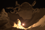
Going for that Pulp Magazine feel...

aboleth-pulp-small.png

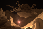
How about this one? Better or worse?

aboleth-pulp1-small.png

And, before you say it, I know it's coming across as more outer space than underwater. I have a plan to fix that...
 
Last edited:

squeen

8, 8, I forget what is for
Thanks for the feedback Malrex! (No perspective preference for the Zine?) I was beginning to wonder I'd committed some sort of social gaff...

I made it with a DIY graphics library and physically-based ray-tracing application I programmed in C and CUDA. I admit I did use GIMP for disguising the spherical incandescent light-source with a star burst.

You could definitely do the same with Blender (free). I did use Meshlab (free) for the terrain generation (the one I've coded in library is procedural and doesn't run on the GPU...yet).

All the other 3D models I used can also be found (free) on the web (e.g. Turbo Squid).

MODIFYING the model-mesh by hand is what takes all the time (which I didn't actual bother doing---I just placed/scaled pre-existing stuff). My thought is that when I go to actually draw the scene, this is a good reference for lighting and perspective. I'm not much of a digital content creator (just some CAD, like 25 years ago), and I don't own a drawing tablet.

...but my ray-tracer is so nice and super easy, it can be hard to stop futzing around with it. On the GPU (graphics processing unit, as opposed to the CPU) it renders stupid fast too.

I also know, anything I draw by hand is going to look way worse. :)

On the topic of color versus B&W: Notice how the monochromicity of the images (due to a single gray material I used and warm light-spectrum) makes it kind of look painted. I think that's (unexpectedly) neat. Something I am going to remember for the future. For D&D products, I am not against adding some tones to the maps/images, but I think a shallow color palette looks much nicer (more professional?) as compared to a gaudy rainbow of primary colors.

But maybe that's just me. (Nostalgic throw back to the days of low-color printing?)
 

Malrex

So ... slow work day? Every day?
I like the sinister 'wet' look, but also curious to see how your latest ones turn out.
I'm just honestly stoked to use some art that's not stock art. Been having a really hard time getting any artists interested to do interiors or the cover. I got a library of stock art, but since coming here, you all have made me incredibly stingy about using stock art anymore...lol.
 

Malrex

So ... slow work day? Every day?
I can see them...but I meant...I'm curious to see when its finished--basically the outer space vibe to the underwater vibe.
 
Top