Illusions

squeen

8, 8, I forget what is for
The following is a short excerpt from an area my players are about to explore. In writing it up, I've tried to focus on Byrce-ian Design principles, and struggled to stay brief (not normally my strong-suit) and further develop a layout that serves "at-the-table" usability.

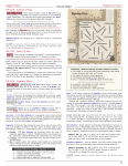
Noteworth items: In addition to segregating the PC's immediately observable data (i.e. the "safe read aloud") just below the section heading, and separated it from discoverable details by a horizontal line, I've also added a few "DM Hints" at the start of this preamble inside gray brackets (e.g. [Unlit,odor]). These are intended as clues for the senses [sight,sound,smell,touch], and sometimes are color-matched to gray text in the body of the description. Honestly, I'm not so sure about the color-matching scheme, particular gray, but I let it go for now.

Also, the decision to spec [Unlit] instead of [Lit], addresses a personal failing of mine as a DM to forget the PCs can't see much by torchlight and just barrel into the full description. Hopefully, this little reminder will restrain me. (Also, [dark] might be better a better descriptor than [Unlit]. TDB...)

Lastly, some background on the setting. These "Dungeon & Drains" exist beneath a Royal Palace. This section are the demesne of a dead(?) Witch-Queen that, despite the well-know proximity, has been walled-off and avoided for decades because it is filled with deadly traps and guardians. Hence the difficulty in penetrating the dungeon is not necessarily a design-flaw, but more an intended feature---possibly requiring a higher-level party to penetrate. This section is intended to be a barrier. Treasure lies beyond. If it's too difficult, it's easy to avoid.

Stats Blocks only apply to Swords & Wizardry. Numbers next to attack-types are (THAC0,damage). And the LORE subsection just ties things into my home campaign and so should be ignored.

Feedback on form and function will be greatly appreciate. The content is relevant to this thread because there are many illusions, that (if treated EOTB-style), (a) won't dissolve at first touch, and (b) have the potential for dramatic demonstration of disbelief (i.e. running through the broken glass, ignoring the attacking knight, etc.). I'm curious as to how they play out at my table this weekend, and would love to hear any flaws y'all spot in the set-ups. You can even just tell me flat-out "Hey squeen! This stuff is really boring!". Seriously. I wanna know.

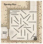
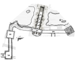
Lastly, below is a partial area map (done in homage to the Moneyblood Design style)---that contains errors/omissions and definately needs to be redone. Towards that end. I am programming a little CAD tool that will help me do better/faster maps in the future. Still, I hope it's enough to help orient reviewers despite a few chopped-off rooms (12 to the left & 18 to the right).
DunDrains-clip.png
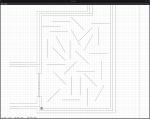
Here are some thumbnails of the keyed pages, and a higher-resolution PDF attached to the post.
VP-D12-16_p76.png VP-D12-16_p77.png

I believe it was @Melan who first said here, "I'll expect your reply seconds after I press the Send button."
(not really...but I am rather excited to hear some comments---It's surprising how much more polished this section, originally written-up this past January around the time of DP's One Page Design Contest, became when I decided to showing it off to the public.)

Cheers
 

Attachments

Last edited:

squeen

8, 8, I forget what is for
Realizing 12' wide tapestries in room 14 are too big while trying to layout a maze with the little CAD program I've started writing.
(Switched to 8')

tapestryMaze.png
 

EOTB

So ... slow work day? Every day?
This is a nice dungeon squeen, it will keep players attention and hangs together very nicely. The skeletons and other opponents are nicely done, the details are chewy, and the challenges are inventive!

I wouldn't saturate illusions more greatly than this. That doesn't mean I would re-write it. Run it as-is, and if the players suspicion is high after getting hit a couple of times and they're usually guessing right (and avoiding/detecting illusions because of this) just lighten the application a little in future stuff. If it runs as you envision it might, don't change anything post-play.

I too like to mix red, black and grey - I think your pages look sharp! One thing I've been toying with is making the bolded inline text you're highlighting for quick scans to be bold red text. Makes it leap off the page. Not sure if that would work well for a published product or not; haven't explored how that might affect POD pricing. But for my own home PDFs that are free to print on a color laser I have access to, it works pretty well. What's bolded red here (headers) I leave black because the larger font and surrounding white space makes that easy to pick out without the red.

There are some sentences I think would benefit from expanding the bolding, especially where two nouns in the same sentence are bold - I'd include the action, too. Example: "concealing six submerged quicksilver skeletons that block a flooded tunnel " - I'd bold all of that. I've toyed with the amount of bolding between light such as you have it, and a bit more, and I find bolding the complete thought/condition/whatever I'm worried may be skipped/missed without the bolding helps me best. I don't tend to bold "what happens before or next", as that's easily recalled (to me) so long as I introduce the concealed element.

Other examples where I'd expand the bolding:

"a 12’-tall alabaster statue of a nude woman with flawless physique wears a glittering crown"
"an armored knight champion steps out of the fire-pit flames"
"laying in a clay-pile at the foot of the statue "

I think the single-word bolding does work good for the hear/smell/etc. Stuff like "clang" - make that pop to jog the DM to use the detail in narrative. The grey in the midst of black text seems off to me though, and that might be idiosyncratic to only myself. I'd probably make that red too, and italicize it. The single-word nature of the bolding and the formatting should make it stand out, even compared to "don't forget me detail-phrases such as above examples. now that I'm thinking about it, I might even play with putting a box around words like this instead of italicizing them. Not sure which would "look better".

These are all nitpicks to an excellent example - very good work!!
 
Last edited:

Beoric

8, 8, I forget what is for
I also like the formatting, as well as the general approach to organization. I haven't had time to go through all of your notations to see if they are consistent, and perhaps I wouldn't know without seeing a larger sample. I think execution is going to be the key.

I get where EOTB is coming from when it comes to bolding certain phrases, but I note you would lose the impact of the way you are currently using it, which is to link common elements together (like the basin in the tapestry maze). You may need two different types of formatting to achieve both, but it may be hard to do that without losing some of the cleanness of the current formatting.

The bolding pops more in the PNGs than in the PDF. Hmm, it appears that the bolding is lost at certain zoom levels. It's weird. I'm not sure why that would be, but if you ever publish you might want to take a stab at fixing it.

Continuing with the tapestry maze, I see why you wanted to keep the "encounter" material together, but I feel like as a DM I prefer to see elements defining the physical space together, and separated from elements regarding the more fiddly monster actions and specialized mechanics. I think I would prefer if, after the readaloud, it was briefly identified that there were monsters present, and where they are and whether they can be seen, but I would prefer it if the monster detail was at the end of the room along with the stats. This gives me a better sense for the whole of the room before I get to combat. There can be interaction with room elements during combat, and for instance I might not have been aware that a character pulling down a tapestry or trying to push by it or climb it would be subject to a confusion effect.

The readaloud does not mention the skeletons, which would be immediately obvious if you enter the west door.

Given that it is hard to make up a maze in my head on the spur of the moment, an inset detail map with the tapestries noted and the starting monster positioning would be helpful. EDIT: I see you have started to develop it, I assume this is your intent.
 

squeen

8, 8, I forget what is for
@EOTB & @Boeric: Thank you both very much for the feedback!

The readaloud does not mention the skeletons, which would be immediately obvious if you enter the west door.
An absolute fool's sin of omission! Proves you need and editor as you quickly become blind to the obvious. I will fix that.

With regard to the bolding: I have been back and forth about this quite a bit myself. It was in fact Bryce and DP's comments after my last posted attempt that sent me in this direction. The mental difference is this: I am no longer bolding to call the DM's attention to interesting elements in the text so much as bolding solely as cross-referencing indicator. I have tried limiting myself strictly (stat blocks aside---and they may lose some bolding next iteration, I think) to a scheme where if-and-only-if you see a bolded word in a paragraph, then you are guaranteed that matching word can be found as a key (first word) to a block of descriptive text. i.e. Cross-referencing mechanism only.

...Or at least, I'm going to try that for a bit and see what mileage I get.

I also take EOTB's point about color (red) as an alternate indicator. I'll have to play with that too.

I also agree with Beoric: the [ENCOUNTER] block chokes the initial text. I'm struggling with how to resolve that. In general, my encounter rooms tend to get a bit comlpex. Feels like I might need some flash of inspiration (from somewhere) to help smooth things out. A new Encoiunter Theory (to irk DP).

Later, I'll tell you all how the evening's play went, but I am too tired tonight.

Thanks again. Good points all around. I know it eats up some of your day to wade through so much text, so it's really appreciated.
 
Last edited:

DangerousPuhson

Should be playing D&D instead
I am no longer bolding to call the DM's attention to interesting elements in the text so much as bolding solely as cross-referencing indicator. I have tried limiting myself strictly (stat blocks aside---and they may lose some bolding next iteration, I think) to a scheme where if-and-only-if you see a bolded word in a paragraph, then you are guaranteed that matching word can be found as a key (first word) to a block of descriptive text. i.e. Cross-referencing mechanism only.
This is good practice, please keep this. You've heard my arguments for it before, but to re-iterate:

It makes it easier to know what the key components of a room are when scanning the description text.
It makes it easier to find specific features of interest when scanning the page.
It makes it easier to know what is or isn't referenced further in the room description (by proxy, this also communicates what is or isn't a mundane feature in the room... no bold = not going to do anything exciting = not worth the DM expending much energy on).
It can be combined seamlessly with other text tools (like colors, font style, bullets, or text boxes).

The old way boiled down to "bold is for emphasis" and left it at that, but there were no rules in place for what exactly needs to be emphasized. One thing I think many module editors don't consider is that the DM is reading the whole room key from top-to-bottom, and so the key should be formatted to better suit the way the situation unfolds sequentially at the game table (putting first things first, so to speak).
 
Last edited:

squeen

8, 8, I forget what is for
I've incorporated some of the suggestions by EOTB and Beoric and attached a new PDF. Thanks guys.

When we played last week, it was only for a few hours, and progress inside the dungeon was pretty slow. The party only got through the Doors of Fear and the Tapestry Maze.

What I like is that a formidable mid-high level PCs party (Cleric 6, Thief 7, MU 8, plus a whole retinue of henchmen), loaded with magic-items, and still proceeded cautiously. These fairly wimpy 1+1 HD skeletons had them quite concerned just because of the topology and the Fear of the Unknown. I feel like that's a victory of sorts as a DM---and way better than having to keep increasing the level of the monsters in either HD or numbers.

Letting the environment do the work is my current mantra.

I think the players did well too, and what I really liked is that the session managed to pry some of their horded magic-items out of their grasp. At these levels, after years of play (and very stingy usage) they've accumulated quite a stash.

Here's some highlights:

The Doors of Fear had the Cleric cast dispel magic in order to get an NPC guide through (who was so ashamed---being young, and this his first time adventuring with the party).

The thief climbed walls to scope out the Tapestry Maze. I ended up letting him see a Player's Map version (briefly), figuring he could see over the 2' gap were the tapestries hung from the ceiling.

The Blur Skeletons (and specifically not knowing how many there were), freaked them out enough they ended up doing the following:
  • the cleric waited for an optimum time (i.e. number gathered around) before turning...perhaps too long
  • the magic-user coughing up the use of a Scroll of Protection from Undead, with them also kicking themselves for not having prep'd protection from evil, 10 radius (this is the kind thoughtfulness, I want to encourage!).
  • since the protective scroll's area of effect is only 5' radius around the caster, and parts of the maze are very narrow, this led to an amusing sequence in which the fighter held the elven MU by her waist off the ground, and the rest of the party held their backpacks over their heads---and the whole group shuffled along in a tight cluster. No weapons out!...and skeletons buzzing around the periphery.
  • the latter was entirely due to the fact that they were determined to avoid touching the tapestries---because they didn't know what they did (in fact the effects ended up being very mild for those that eveutally did, confusion 1-round)
What I liked:
  1. The Fear and Dread in a party that was way over-powered for the situational threat.
  2. triggered some resource usage
  3. I had not anticipated climbing---but I liked it! (Player Map hand-out a must)

What they didn't like: (Kabitzing at the table)
  1. the maze (not seeing ahead)
  2. skeletons with multiple attacks
  3. the fact that I said it would take 2 rounds to light the tapestries---big (pointless) argument erupted about how easily wool ignites. I was mocked ruthlessly for my ridiculous notion. (They were channeling DP.) :)
  4. the fact that I ruled you can't make a flaming arrow by just pouring lamp-oil on a regular arrow.
  5. the mechanic that said if they were confused they had a high probability of bumping into the tapestries AGAIN the next round---they thought their fellow part members would immediately come to the aid. It would have probably hit-the-fan if said Confused Souls had accidentally lashed out at a fellow party member.
What I still have problems with:
  1. infravision: What the hell can it see? Just thermal? Does it work in TOTAL DARKNESS without heat-sources? ...or just DIM LIGHTING, like outside by starlight? How close to lanterns spoils it? Honestly, I wish every PC was human sometimes. I LOVE what darkness does for the ambiance, but I have been previously lax at lighting in general, so my players are now having a hard-time adjusting to my increased adherence.
  2. The altered Maze Combat---I kept forgetting to check if they bumped into a tapestry. I also forgot what happens when you both surprise (had to look it up later).
Anyway. I think the adventure played well so far.

Next up, ILLUSIONS! (The Sea of Glass...with the quicksilver skeletons arriving late from behind!)
 

Attachments

Last edited:

squeen

8, 8, I forget what is for
Futzed with GIMP this weekend to "dirty up" the inset map of the Tapestry Maze. I made the construction lines using the little AutoCAD-like program (circa 1994) I am writing, followed by GIMP to give it a less computer-generated look. Honestly, I'd prefer using pencil/paper, but I don't have my scanner to bring it back in---hence the GIMP paint-brush with a mouse.
tapestryMaze-small.png
You can see the image inside this PDF along with the evolving format. I've taken EOTB's suggestion of using red for the senses-keywords in a weird direction---not sure if I love it, but my eye "finds it" a lot easier in the paragraphs.

Also, added blue as a hint of hyper-text cross-referencing instead of bold. This is nice (I think) because it frees up regular black-bolding for other emphasis. With the two combined, it feels a bit like I have "pre-highlighted" the module for Bryce. I also made use of some boxed keywords for encounters and traps.

Hopefully with all this crazy annotation going on, it hasn't made it unreadable/uninspiring/impenetrable for the not "at-the-table" casual reading crowd.

WIP.
 

Attachments

Last edited:

squeen

8, 8, I forget what is for
Thanks EOTB for taking a peek. I do appreciate it. I know you can't please everyone, but I'm hoping to converge on something generally regarded as "nice" in time for the Footprints submission deadline, and then redo my whole Earth Temple thingy in a more usable format.

I do think there may be a bit of a trade-off that needs to be made between readability and usability. Simply put, I think the segregation of text into little cross-reference-capsules may be good as a technical document for Bryce-ian "at the table play", but may also come off as dis-jointed and cumbersome for someone scanning the document and deciding if it's worth "picking up". i.e. curb-side appeal may be low.

I imagine illustrations might help there.
 
Last edited:

squeen

8, 8, I forget what is for
Hmmm...had trouble downloading the PDF on my stupid-phone, so here's an image of the first-page for those having similar issues.
PalaceDrains-DRAFT-p78.png
 
Last edited:

Beoric

8, 8, I forget what is for
I like the blue font very much, at least on a computer screen. How does it look when it is printed?

I dislike the red outline font in the "ENCOUNTER (basin)" section. Solid red would probably be fine.

Your choice of font size is hard on my old eyes. You must be writing for DP's generation.
 

squeen

8, 8, I forget what is for
Thanks for the feedback Beoric! Agreed, I am not sold on the red outline font, but I thought it was worth a try. I am red-green color blind, to solid red don't pop for my old eyes. The blue pops for me too, but I haven't printed it yet---good point.

The PNG version of the text (pg.1), is only 100 dpi, so everything is extra blurry. The PDF can be zoomed, and I've measured the printed version several times and it's no smaller than the 1e DMG or PHB font. I am, unfortunately, partial to higher density of info for quick scanning (and near-sighted)---things leaking across pages vex me more than squinting a bit.

Thanks again. It helps to hear what works and doesn't.
 

DangerousPuhson

Should be playing D&D instead
I suppose the lesson here is that if you publish for OSR, you'll want three formats: hardcover, PDF, and a large-print edition (which you'll want to sprinkle liberally with crossword puzzles and editorial about how minorities are scary).
 

squeen

8, 8, I forget what is for
Thank you DP. That is some very valuable feedback. I will start working on the appropriate side-bars.
 

DangerousPuhson

Should be playing D&D instead
Welp, now that I know about the general average age of forum members around here, get ready for a shit-load of jokes about pushing hoops with a stick, or taking sweethearts to sock hops at the malt shoppe.
 

squeen

8, 8, I forget what is for
Man, of man...malt shops...those were the days! Real people having real face-to-face interactions...but that was before the Sickness came and our computer overlords forced us to speak to eachother only through them.

err...I mean....It's much better now.
Hail Overlords!
 

Malrex

So ... slow work day? Every day?
I looked at the Palace Drains at the layout.
My initial thought--it's busy. BUT..I see what you are trying to do and I like it, but I think it needs to be further reduced. Busy=my eyes keep going back to the red, the blue, the bold...trying to remember what's what. After awhile, and understanding what you did...I could see getting used to it and finding it helpful...but at first, it was a bit jarring.

It feels like every room has 3-5 things special about it that goes into more paragraphs of information....the benefit of that is how you have it, it can easily be skipped if a player doesn't take a closer look, but it also makes rooms pretty long. It's like you have cracked the code for making the best of two worlds...those who like to skim, and those who like more info...but I'm not 100% sold on it yet...

The first few descriptive words (Clang, Dark, Roaring, etc)...I feel like I would have to read the whole dungeon first, then those descriptive words might be helpful to trigger what's going on in the room. I would maybe even just italicize them because they are short BUT more importantly, my eyes don't keep going back to them when I'm scanning because that red block is catchy.

I'm wondering if some of the descriptions....lets just take the bull statue for example--VP D20. Is all that descriptive info necessary?
The first paragraph is good....I like the line that breaks things up if players look closer, they get more description--works just like bullet points, so I like it. But I'm wondering if people would hear the noise and flashing lights first thing..drawing their attention to the archway..then the bulls. I'm wondering if you could take some of those descriptive words of the archway and put it in the descriptive writeup....so the only note you have about the archway is that it strongly warded to block extra planar creatures.

The bull stuff is ok, although the last sentence with the platform of skulls, I think would be in the first descriptive paragraph...people going to notice that...
The skull crest...I feel like you could add that its always looking at people in the first descriptive paragraph....
The CHALLENGE...is doing all that in 3 sentences.
It's like you got all the right stuff there...but I feel like you can combine some of that stuff yet, still keep it short.

The Tapestry room....this is a complicated room. I'd almost make the basin part its own room number to break it up a little bit.
I would probably have 3-4 sentences of GM Notes before the room. Your box with bullet points for rules in this room is GOOD. But I think I would have it in GMs Notes before the room description.

The zoomed in map is great---and I have been playing with that type of layout with Vermilion a bit. BUT for this room's situation, I'm almost wondering if 'X' on the map for where the monsters are would make it more clear (I know you said randomly). I feel like I would need to read the Tapestry room 3-4 times to fully understand everything that's going on.

You got it broken down, but there is SOOO much info in there it just makes it seem clunky.

I would have blurred and quicksilver skeletons in new monsters at the end of adventure..you could do pdf links to quickly zip over there and back. That would get rid of a few sentences describing what they are...

What or who is trying to ignite the tapestries? Is this part necessary or can it be a 'trust the DM' type thing if players light them on fire. Again, if necessary, this could go in the GM notes.

The room is cool...I like the idea of it...its like you got everything there and I think you got some good layout ideas, but its almost like you are overkilling the layout idea and maybe adding too much description to stuff that may not need it? Does that make sense?

VP D16...what happens if they do end up breaking the glass...does the moat fill up the dungeon?

Anyways...some initial thoughts.
 

squeen

8, 8, I forget what is for
Awesome Malrex! Thank you so much for all your help and feedback. Sometimes with community development work it feels like shouting into a void. It's always been the case (with open source software) that there are many casual users, but very few willing to step up and become developers. You sir, are one of the latter---a class act in my book.

With regards to your comments. I think the format needs work---particularly with regards to the "red" labeling of the senses. It IS busy, and it may be that I've gone too far with using visual clue to cross-reference parts of the text and need to ease off a bit there. I am thinking that RED as a color is maybe too strong for most, and I should just use black (possibly inverted). But more so, drop the cross-referencing and just focus on better descriptive text in the initial paragraphs (above the line).

However, I am loath to completely abandon the DM hints --- in particular about lighting. I don't want to clutter the text OR map (I find too much color on maps off-putting in a childish way), but I DO need something to prevent me (as stupid DM) from just barrling into the description without consideration to lighting.

I am currently thinking I should stealing a page from Grutzi's excellent Citsern of the Three-Eyed Dwarves, and just reducing the notion to a maximum of 3 or 4 (very) small icons at the start. They would indicate:
  • a bullseye's for an encounter
  • a lightbulb (lit or dark) to indicate visibility
  • a bell to indicate sound
  • something (nose?, wavy odor lines?) to indicate smell --- but I might just skip that and make sure it's in the text
Also, I think there should be an illustrative diagram to explain the notation, up front. I may work on that next.

Also, as you point out, brevity is not my strong suit. I find that I work in cycles, as follows:

a) sketch a map​
b) loosely key it in a very boring way​
c) re-key it and add some interesting detail that's too wordy​
d) re-key it again with an eye for terseness --- eliminate some stuff that doesn't work​
e) redo the map (and possibly expand content with a better eye for the BIG PICTURE)​

It's step "d" that really benefits from feedback. I need help whacking away at the cruft and hearing what's confusing. The Maze Entrance part you focused in on was "newer" than the rest so more of a stage "c". That Tapestry Maze had already gotten a redo thanks to Beoric and EOTB.

I really take your excellent point about breaking up the tapestry room in two (basin separate) and just annotating the map more and keying it that way. Smaller chunks for easier digestion! That may have to become another mantra, like Byrce's: "NO F***KING LONG PARAGRAPHS IN ITALICS! EVAR!" (minus the virtual vitriol).

I'm using this format now in my own home games and hope to come to some sort of conclusion about "at-the-table" utility. What I have learned is the following:
  1. Huge paragraphs of text with bolded phrases does NOT cut the mustard. I get lost in my own work, especially if some time has passed since I wrote it.
  2. Bryce's preferred uber-terse stuff leaves me a bit flat. It's precisely those small (interesting) details I am unable to come up with on-the-fly.
  3. I really like the cross-reference style for detail --- again, Layers of an Onion. The more you examine, the more you can see, both at the room-level and the dungeon-level---but it needs to not get in the way of a fluid game. So far I am satisfied with:
    • blue text for cross-ref (it frees up bold for other emphasis, and catches my eye without overwhelming it)
    • the horizontal separator to delineate what's immediate from the supporting text (onion layers)
    • the boxed ENCOUNTER and TRAP flags as a DM "head's up"
    • the LORE section to add extraneous context. I added a "dagger"-flag to indicate in-line what text has some more superfluous detail below in a footnote style.
When this whole section of the castle dungeons (and maybe upper levels) is finished, I think I'll make it freely available to all if I can find a place to host it --- probably not DriveThruRPG...just 'cause that seems like such a harsh home.

Oh yeah --- break the glass = flood the dungeons for a week.
(Lastly, with respect to fire: see the play-report above --- I KNEW my dang players would try to ignite those tapestries!)

Thanks again!
 
Last edited:

squeen

8, 8, I forget what is for
Been developing my map/layout application some more too. It allows me to import a scanned (hand-drawn) map and then add CAD-like vector graphics over top with obsessive engineering detail. I can then use the output as "construction lines" to hand-ink and add Glynn Seal-style rumble and shading. I know seems like a stupid amount of work, but I find it relaxing---and I really like how easy it makes it to re-jigger the map as the design is fleshed out. (...and keeps my lines straights and circles...err...circular!). The power of a CAD package versus a raster-painter program like GIMP is the ability to precisely trim lines, grab end-point, intersections, enforce perpendicularity, move/scale elements, etc.

Programming wise (in C99) it's still missing a lot of the GUI bells and whistles (e.g. layer manipulation) --- and, right now, it's mainly command-line driven (keyboard short cuts) like late-90's AutoCAD (R12/R13) used to be. Still...I choose to play the Long Game and develop exactly what I want, as oppose to forever struggle with someone else's software. When it works (at all!), it's a joy.

For example, I'm tickled silly at how it auto-adjusts the density of the grid (10x10, 5x5, or 1x1) based on zoom-level. Makes those inset-maps easier to generate! (Sorry the images are so big -- 4K monitors on a workstation, man, are freakin' AWESOME)

asnap1.png asnap2.png

So far, it's doing what a good hobby should --- eating up all available time.
Miles to go...

NEXT UP: The Ethereal Islands of the Phase Minotaur
 
Last edited:
Top