Introductory Adventure Covers

Beoric

8, 8, I forget what is for
I've been trying to pick out a coherent argument here, other than "here is some art that I think is cool". I think some thought should be given to what the cover is going to be used for. So I think of the classic cover for the 1e PHB, which gets you as a player focussed on exploration, interacting with your environment, and acting with stealth, guile, and care - because the players are clearly the one's stealing the idol's eyes in that picture.

Contrast that with the cover for the 1e DMG, which shows a monster (clearly winning), and strange new worlds (the City of Brass).

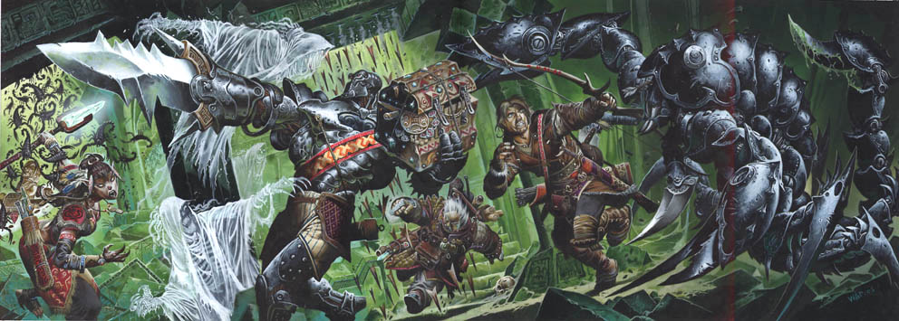
A lot of more recent products, like campaign settings, are intended for both players and DM's, and need to strike a balance. Here is the inside cover for the 3e Eberron Campaign Guide, which needs to introduce the peculiarities of the setting, and appeal to DMs and players.


So you get the pulp feel which is intended for the setting, some unique setting elements, and a sort of balance between team monster and the PCs.

Compare to this piece by the same artist (Wayne Reynolds), which IIRC is for monster article. Here the monster is clearly the centerpiece, and its power is highlighted:


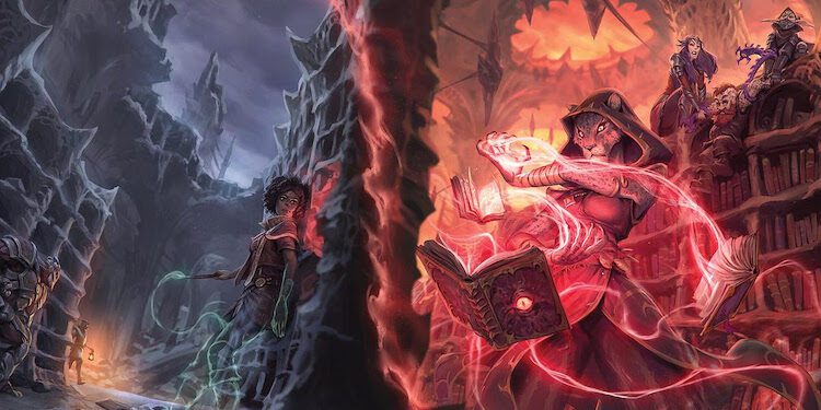
Now look at this, from Chronicles of Eberron, which is intended for players and DMs:


The raksasha on the right is Hektula, the First Scribe, who sits on the Bleak Council of the Lords of Dust; she is also prakhutu to the godlike Overlord, Sul Khatesh, the Keeper of Secrets, who temps mortals with secrets of knowledge and power. She clearly outclasses the PCs, who, as in the 1e PHB, must seek their objective through stealth and guile. The scene appears to be taking place in the library of Ashtakala, a city in the Demon Wastes. So this cover essentially combines elements of the 1e DMG (overpowered monster, strange new world) with elements of the 1e PHB. This is by Thomas Bourdon, based on an idea roughly sketched out by the guy who commissioned it, Keith Baker.

If you want to see what Bourdon was working from, here is the concept sketch:
1679160151030.png
 

Beoric

8, 8, I forget what is for
I sort of assume everyone knows what the 1e PHB and DMG look like, but for any who don't, here they are, respectively:


squeen

8, 8, I forget what is for
The first one is a jumble to my eyes. I can't tell who's who and the giant sword is a turn-off. In general, Reynolds is a bit too cartoon-y for my tastes --- the raksasha an example of the icing on that particular cake.

The last is the best of the bunch, by a pretty good margin. Good composition and interesting perspective.
 

grodog

Should be playing D&D instead
Also, can anyone definitively tell me how the hell to pronounce Tsojcanth?
While definitive is a bit of a stretch, I say "Saazh-canth".

Great resource Allan!
Adrian's site is pretty great, especially if you're trying to sort out boxed set contents, or look at back cover art/text.

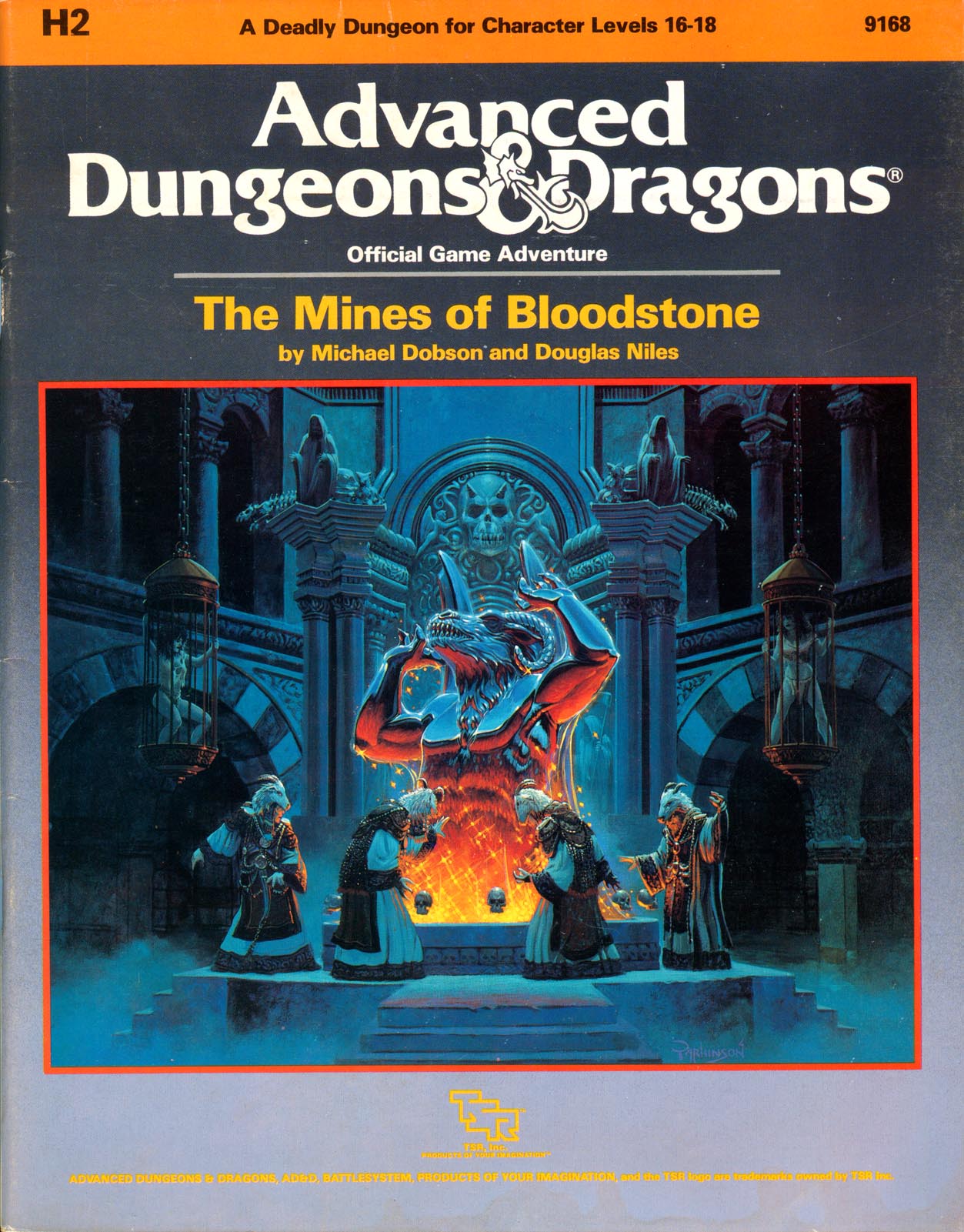
I had never seen this H2 before. Pretty sweet.
I prefer it to the ToEE cover, myself.

I bought the 1st printing of the D-series and thought I was alone in my fascination with the D3 cover. So hauntingly Lovecraft.
I love the sacrifice in the mono cover---in particular the blood drenching that has pooled at the base---but I also love the color cover too, and if I had to pick, I'd likely still go for Otus' Eclavdra :D

The only thing I liked about the 5e Demogorgon piece was the background trailing off into the distance on the left ;)

Allan.
 

The1True

8, 8, I forget what is for
While definitive is a bit of a stretch, I say "Saazh-canth".
I've been waffling between Tzoh-dge Kanth and Tzoya Kanth.
Next question: Three or Four syllables in Tamoachan?

Bonus question: What percent of the OSR says Ju-Bilex and Gela-TanEous as a matter of common-law? This shit bugs me almost as much as Foilage, Calvary and pa-LADin...
 

marksable

*eyeroll*
Sorry if this is off-topic, Commodore but I really enjoyed running Whitecliff and I'm wondering if you're planning on publishing a new adventure/campagin like that anytime soon (I already own everything else you've published on DriveThruPRG).

So I'm reviewing introductory adventure modules. Not the adventures, though, the cover art. My theory is that the tone for every edition is going to be reflected more accurately by that one illustration than by a dozen examples of play. Basic was easy, that's In Search of the Unknown, but what would you classify as the AD&D "introductory adventure"? Night Below and Sunless Citadel will be more obvious for later editions and I think I'm going to look at the start boxes/beginner boxes for the later adventures. Not looking forward to the generic mush of Lost Mine of Phandelver but I already know that's going to be very reflective of the edition its representing.
 
Top