TerribleSorcery
Should be playing D&D instead
Sorry but I must reply thusly:
") ), I really like him---both as an artist and how he comes across as a person. It's a fun interview.
), I really like him---both as an artist and how he comes across as a person. It's a fun interview.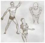 n muscle placement. At one stage in each drawing, everyone looked like a lithograph out of Grey's Anatomy (i.e. no skin).
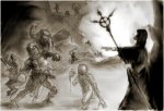
Me too it's embarassing. But, I appearently lack internet modesty...Suggestions
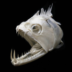
I hate the fish skull bubble thing. Maybe it needs to be a little smaller? Its just really hard to tell what it is. That's my biggest gripe.
The Shaman is a half-goblin bad guy. He needs a complete redo. The only thing I want to keep is the dark cloak silhouetted against the bright background and the staff. I really ran out of stream at that point in the sketch---out of the time I allocate myself each morning.Suggestions
Looking at it again....Is the shaman a good guy or bad guy? At first I thought he was a good guy, but now I'm uncertain. If he is a bad guy--I'd consider putting another adventurer in there--perhaps just a dark shadow, facing off on the other ones coming in--so low detail/shadow shape. Or perhaps a dead goblin...
Shaman's bracelet looks a tad too big...like it seems like its going to move up and down the arm pretty annoyingly for the wearer.
I think the dagger is too long for the goblin in how he is holding it...looks like he is holding a shortsword like that--I'd consider shortening it.
the goblin on the back of the warrior...is he holding a dagger? or just using his fist? It's a little hard to tell. I think it would enhance the danger vibe if he is holding a short dagger.
I love the 3 goblins near the top of the page...I think they are perfect. I think the 4th one that is near the bottom of the hill should be a little bigger since he seems closer? does that make sense?
Are those more goblins emerging from the smoke? I'm wondering if they could be enhanced somehow..maybe a larger, lighter gray shadow in the smoke or something. I thought they were rocks at first.
Other Comments
I like the blurred out style. The warrior has a little detail which is cool...and it makes the blurred style ok because with the little details, I can fill in the gaps with my imagination. BUT...I'm wondering if the goblin holding the dagger/shortsword--wondering if he should get a tad more detail like the warrior since he is closer. Maybe its just a necklace or something.
I also really like the goblin on the warrior holding down his sword arm.
Id focus on the warrior I think, especially if the shaman is a bad guy.

| One final GIMP tip: Use a large brush with 25-50% opacity. This allow you to feather in the edges. For an even lighter touch, either paint in a layer with reduced opacity (e.g. set it less than 100% on the overlay layer) or else just adjust the opacity on the paint-brush itself. This applies to smudging too. If you are going for "painted/realism", use this technique to make profile edges disappear to a hair line (on the lit-side). |
Too busy with work. This take less effort. 1/2 hour a day before sunrise. Did the sketch yesterday, the post today.Your commitment to doing everything peripheral to adventure writing without doing any actual writing is commendable.
j/k, much love squeen
Dig a hole and stick my head in it....what does everyone else want to do?