Illusions

The Heretic

Should be playing D&D instead
Of course not. If they ask how the monster looks, I might say 'bloodied' or 'badly beat up' or 'not even breaking a sweat'.

Btw, Bloodied is a specific condition in 4e, where a monster or PC is now at less than 50% full HP. This can trigger effects in game.
 

Beoric

8, 8, I forget what is for
I have modified the framework I use in my VTT so players can see the monster's hit points bar, without actually knowing the hit points. It is totally worth it for the look of despair they get when they do a large amount of damage and the bar barely moves, or the look of triumph when they do an ordinary amount of damage and the bar almost disappears. I don't really care if they know actual HP, but my players seem to be content with visual or narrative depictions instead.
 

Beoric

8, 8, I forget what is for
That 1e takes a bit of practice to master is not a deterrent to me. Friends, I'm an engineer. I design aerospace control systems all day, every day. I LOVE a challenge (with a pay-off). I see that you (Beoric) have that kind of mindset too. A desire to take things apart and see what makes them tick---with no fear with regards to building your own widget. More power to you! Keep kicking the 1e tires. I don't mind. Someday I may return the favor with 4e, but for now I'm focused on a 0e --> 1e transition.
I started a thread so we can have these conversations without blowing up the threads where the questions arise.
 

squeen

8, 8, I forget what is for
In the campaign, on the AEther Islet, the players found the remains of two ethernauts partially cocooned by the ever-growing island.

Both were wearing spacesuits. One's chest had clearly burst outwards (Ethereal Ghuls), the other had it's head bashed in (by the Minotaur). Lastly, the were remnants of an android---it's head wedge up in the ceiling.

I haven't got time to blather on about this in my usual fashion --- but I think the Ethereal Plane can be an amazing segway in to the SciFi/Gonzo. Infinite tiny worlds. All sort of bizarre civilizations at different levels of development and all the "rules" with regards to magic and tech can go out the window without totally screwing up your home campaign. It is totally a Through the Looking Glass opportunity.

Also consider this: It's a potential direction of exploration that solves the high-level play issue without destroying game balance. It sounds like Huso took his campaign to the Abyss to accommodate higher levels. The Ethereal Plane offers a more nuanced alternative --- with both good and bad denizens.

I am thinking of going all-out Mandalorian Armor from the ethernauts. The two suits are both damaged, but if the PCs can get them to a master craftsman then I'll allow them to cobble together a single working suit.

Here's a Sci-Fi concept that dawned upon me yesterday.
They found a limited number of power-packs and can choose where to pulled them in.
a) the Mandalorian Armor
b) the android head
c) a phaser pistol

Power as Resources Management! (...until it's gone)

What got my creative juices going was the notion that the Armor (normally just leather-class protection) can be "powered up" one of two way:
1) rigid-ized for an amazing AC (-1?) that last for 1 turn/charge
or
2) force shields that will absorb 10-hp/charge
Also,
3) jet-pack fly (0.1 charge/round)

With the AC and force-shield I was think of also allowing the user to customize them directionally i.e. more to the front or more to the sides/rear.

Lastly, I also want to say something someday about three-dimensional play...

What do y'all think? Ethereal SciFi anyone?
 
Last edited:

squeen

8, 8, I forget what is for
Also on the topic of Adventure Design: Formating
(a topic no one wants to respond to unless it's loaded with Editions-War Fodder)

I've been playing around with small icons-clues to convey info with regard to the immediate sense-stimuli one is exposed to when entering an area (i.e. encounter/lighting/sounds/smells).

Here's an example from the Drains region:

drains-icons.png

Yes. That's a poop-icon for "bad smell". I couldn't think of another one.

Here's my current (full) working set:
sense-icons.png
 
Last edited:

DangerousPuhson

Should be playing D&D instead
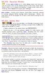
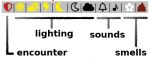
Your icons could be a bit more clear. A bell could mean an alarm, or a reminder, or something other than noise. Same with lighting (does the sun mean source of natural sunlight, or just fully illuminated?). The poo could mean there's deep shit here. Etc. With icons, it helps to make them nearly immune to being misconstrued.

I suggest light bulbs for light (black for darkness, lit for light), a speaker for sound (like the Windows tray icon), a nose and stink lines for smell (the poo isn't a bad idea though!), crossed swords for a hostile encounter (a shield could mean safe or defensive or something other than encounter) while a speech bubble denotes a non-hostile encounter, etc.

You're using your icons to cover too broad a spectrum - their intent should probably not be to communicate the information about how much light there is or if smells are good or bad, but rather their role is to be like "Yo DM! Something smelly here, better pre-read this area!". Catching scanning eyes and focusing them on the further information. The DM is going to be expanding on the room description when he describes it to the players, so it serves no real purpose to have icons explain stuff to the DM since he needs to read the full room text anyway.

FYI as a practice, I've taken to including icons on the map rather than in the key - it helps to know which rooms are illuminated or have a monster or something in them when looking at the map because it helps with the ever popular "I listen at the door" action or in describing light coming from the next room. One of great importance is an icon to denote an immediate hazard in a room (like something the DM needs to inform the players ASAP because danger, like no air or unbearable heat or something) - I personally use an exclamation mark.
 
Last edited:

squeen

8, 8, I forget what is for
You're using your icons to cover too broad a spectrum - their intent should probably not be to communicate the information about how much light there is or if smells are good or bad, but rather their role is to be like "Yo DM! Something smelly here, better pre-read this area!". Catching scanning eyes and focusing them on the further information. The DM is going to be expanding on the room description when he describes it to the players, so it serves no real purpose to have icons explain stuff to the DM since he needs to read the full room text anyway.
That was my intention---just attention grabbers, not detailed info. The lightning is just a candidate and may be scrapped. I felt like the light bulbs were too anachronistic, but considered them. (Same with speaker)

The Key:

encounter
something here can move (shield)
nothing alive (absent)

lighting
bright light (sun)
dim light (lit moon)
darkness (black moon silhouette)
fog/unnatural darkness/dust/etc (black cloud)

(partly sunny is probably going away)

sound
loud (bell)
soft (musical note)
none (absent)

smell
flower (pleasant/faint)
poop (bad/strong)
none (absent)

I am very afraid of the icon notation --- which should only say WARNING: SEE TEXT! --- gets too heavy. I could collapse it more (i.e. just one light, sound, smell...or nothing).
I may ditch the grey background...and the colors.
Also, I really am not found of light on maps...dunno why. Too cartoon-y?

Thanks for the feedback.

EDIT: Also, I feel like I need SOMETHING to keep reminding me as DM that it's DARK. I tend to overlook that too often.
 
Last edited:

DangerousPuhson

Should be playing D&D instead
Icons.jpg

This is how I'd do the icons you have in area VP-D17, for example. They can be customized to display the amount of info I think you want (you can color in the lightbulb to denote a color of light, for example, or change the smell icon to a smiley face instead of a sad one for good smells, and remove some of the sound lines next to the speaker for softer noises, etc.)
 

squeen

8, 8, I forget what is for
Could also go overboard and try to tie all the encounter elements together with the icon

encounter-icon.png
 

squeen

8, 8, I forget what is for
Just remember this is a DM-eyes-only thing - no fear of breaking verisimilitude, so maybe go with what is most practical.
Understood...but the DM "mood" matters too, I think.

Nice icons though!
(Unfortunately, I don't think I would dig seeing a book full of noses.)
 

DangerousPuhson

Should be playing D&D instead
If you're dead-set on salvaging what you've got, might I recommend duplicating the icons so that you can put an icon copy in the descriptive text next to its pertinent information (like if you've got a smell icon at the top, you should also put the smell icon next to the thing that smells in the key description so you can easily find the smell information)? You seem to have it for the encounter icon but not the others.

Or perhaps a small table with the icons running down the left column and then information about the icon in the next column. Like if you have a light icon, and then next to it it says "Firelight, flickering" or "Blood red, unknown source", something like that?
 

squeen

8, 8, I forget what is for
Yes. Good points. I think I may know why this doesn't get used --- is either too ambiguious or else clogs the descriptions.
 

DangerousPuhson

Should be playing D&D instead
I like that! It facilitates quick-referencing sources/characteristics of both ambient and pertinent sensations, and I can tell at a glance if there are numerous sources or not.

If you wanted a less-intrusive option, you could instead tie each icon to a color and color the pertinent text related to it (though the way you've done so far has a nice aesthetic to it as-is, and is slightly more B&W printer-friendly).
 
Last edited:

DangerousPuhson

Should be playing D&D instead
Now that I think of it, you might want to try moving the icons from their spot in-line with the top paragraph over to the spot right after the room number/title. I believe it would make them more legible, and I think might help your room keys have an overall cleaner look (especially if you feel comfortable employing a right-justified icon set).

It may sound like I'm jumping in with too many ideas, maybe assuming control in some small way. Not my intent, so I apologize if it seems like I'm stuffing changes down your throat. For what it's worth, I went to design school and I'm professionally-trained in layout & publication.
 

squeen

8, 8, I forget what is for
Now that I think of it, you might want to try moving the icons from their spot in-line with the top paragraph over to the spot right after the room number/title. I believe it would make them more legible, and I think might help your room keys have an overall cleaner look (especially if you feel comfortable employing a right-justified icon set).
I though the same thing. Maybe right justified after the title. I'm going to need to figure out how to get LaTeX to do that with some easy macros.

It may sound like I'm jumping in with too many ideas, maybe assuming control in some small way. Not my intent, so I apologize if it seems like I'm stuffing changes down your throat. For what it's worth, I went to design school and I'm professionally-trained in layout & publication.
On the contrary! Why else post them if you don't want feedback and ideas? I will definitely ignore what doesn't suit my particular tastes..

Many thanks!
 

EOTB

So ... slow work day? Every day?
Nice work, Squeen.

Good advice, DP.

Something about how the colors work together doesn't quite click for me, but this is very small and not a dealbreaker in any way.
 
Top