Illusions

Beoric

8, 8, I forget what is for
Its getting pretty busy. To be honest, I would have to work with the whole of your formatting for a while to see if it ever became intuitive. I think I prefer black and white icons, but I really can't be sure.

I find the yellow icons draw my eye so strongly it is hard to focus on the text.

I felt like the light bulbs were too anachronistic, but considered them. (Same with speaker)
Um, torches or candles?
 

squeen

8, 8, I forget what is for
I think EOTB and Beoric are both correct. Too many primary colors makes everything look all tuity-fruity. The yellow is just too strong and out-of-palette. Both with the text and the maps I prefer a very shallow color pallet. It just looks more "professional". The one exception that works for me is the blue hyper-referencing.

That's honestly where I started, but the black-sun never looked quite right. I should find a good torch, but I didn't really want to use an image-icon, these are just embedded glyphs in the font (less over-head in a large document).

I am switching back to black & white (or gray-shades) for now. To heck the darn sun!

That leaves us here:

encounter-icon.png

What I am after:
  • helping the DM know immediatelywhich visceral elements should pop out at the players.
    • Those are sight, sound, smell and also the "unpredictable motions" of other living creatures (encounters). Faster play. Fewer mistakes. To that end, too much visual clutter (icons everywhere) is probably worse than none at all.
    • fewer DM errors (mine) --- particularly with regards to lighting
  • something visually pleasing on the eye.
    • An adventure book should draw the DM in to a comfortable mental place---ownership of the text.
    • I see maps as both DM utilities AND illustrations that also make the book inviting and easy to find your place. Just like the text, I am reluctantly to clutter them or make them too garrish with colors/labels/icons.
  • layers of the onion via cross-referencing
    • the blue cross-referencing are there to allow for more in-depth details without wall-of-text impenetrability
    • For some reason my eye catches on blue, but does not fixate on it (like yellow) --- especially the darker shades.
    • blue cross-ref still permits use of independent (normal) black bolding---which is visually stronger than just italics
  • I stubbornly want an icon for darkness. Probably should just like it go...
 
Last edited:

DangerousPuhson

Should be playing D&D instead
I see maps as both DM utilities AND illustrations that also make the book inviting and easy to find your place. Just like the text, I am reluctantly to clutter them or make them too garrish with colors/labels/icons.
It's a shame you are so adamant to leave maps untouched - they really are the best place to denote light/sound/smell as well as encounters, specifically because it's when the DM is looking at the map that he will most need that information (needs to know if there's light coming from down the hall, or movement from behind the door, or monsters within earshot, or whatever).

I have some examples if you'd like to see how I do them.
 

DangerousPuhson

Should be playing D&D instead
Here is my basic map style from one segment of my megadungeon project. I've included three maps in the link: the overview map of the area, a less intense B&W variant, and what I call a "bite map" (small section of the overview map to go in with the room keys to save on page flipping).

The light situation is captured in the room numbers on the map - black numbers mean dark rooms, any other color is the color/intensity of light in the room (area A1, for example, is lit by exterior sunlight and so the "A1" is white. Area D17 is illuminated by a pool of lava, so the "D17" is orange.) Exclamation mark icons next to room numbers denote a hazard that must be brought to player attention before they choose to enter the room (because something can hurt them or they'll need to take precautions, and it's not exactly fair to let them wander into it without warning). I've captured monster/NPC locations with "X"s which also shows their initial hostility (red stroke border indicates something that attacks on sight, black means hesitation or neutrality or just a threat that's not immediate), along with enemy patrol routes/reinforcement plans (arrows, with stroke border on the arrow denoting either reactive movement or passive movement), and things like locked/stuck doors, traps (with area of effect), and obstacles like barricades (like those in front of the D6/7 door).

Things may look cluttered with all the info, but remember that the DM only needs to look at the spots adjacent to where the party is now, not the entire map all at once - you'll notice that when looking at the bite map things seems less chaotic, even though the situation hasn't changed at all in the dungeon, and the bite map is just a cropped/layer-adjusted pull-out from the main map.

I made these a couple years ago, so there are some things I'd change if I were to do it again (for instance, I have no indicators of sound sources).
 

squeen

8, 8, I forget what is for
Very nice maps. Lava! Lots of good inter-connectivity. You could probably anticipate that my tastes lean heavily towards more muted colors---but that's just my preferred old-man's ascetic.

Movement 'X's and lines for battle --- think I might just include those on the zoomed-in "inset" maps.

I'd also suggest the exclaimation-point-in-a-triangle as the standard warning symbol.

I think you may have hit upon a real neat and simple idea---having the style of the room number convey something about the lighting. That's very elegant, and something I'd like to play with. Black or outline letters for unlit --- white or solid letters if lit???
Hmm...might work...

Thanks for sharing.
 

Beoric

8, 8, I forget what is for
Its funny how may of these things I no longer think about because I use a VTT. When I want to light a room, I place lights in the room. I don't need an order of battle, because I can see all the monsters on the map, and can see lines of retreat and where support will come from. I do need information on sounds and smells, but I usually place an "Information" marker with stuff like that and click the marker to get all the information that is not obvious from the map.

I like how DP's maps are simpler than most modern maps. I was trying the modern quasi-realistic style for a while, but it took too damn long to draw maps, and my players got way too invested in the set dressing ("What's with that rock that's brighter then the rest?" "That's just an artefact of the dungeon design program." "Is that something hiding in the corner?" "No, it's just shadows caused by mood lighting, ignore it."). I tend to go quite minimalist now, only including details that are actually relevant.
 

squeen

8, 8, I forget what is for
Wow. That's kind of a big deal really. VTTs will probably reshape the hobby. In many ways, having proper computer-aided DMing was a pipe-dream...but now?

Can you post a "modern map"?

Still, for old-school paper-published material...
 

Beoric

8, 8, I forget what is for
Wow. That's kind of a big deal really. VTTs will probably reshape the hobby. In many ways, having proper computer-aided DMing was a pipe-dream...but now?

Can you post a "modern map"?

Still, for old-school paper-published material...
You can do more complex things with a VTT that would totally not be worth the effort in a pencil and paper game. Anything that requires tracking by round, or complex math. If they build it in, like dynamic lighting, it doesn't require much effort to use either.

On the other hand, if you are like me and try to make it do everything but make you a sandwich, it can be a bit of a time hog out of game, but the game itself can run like a dream. The modified framework I use will let you make several attacks at a time and automatically determines if attacks hit, calculates damage, deducts the damage from enemy hit points, tells me if they are bloodied or dying, tracks any conditions that are applied, and gives me various reminders of the sort of things I am likely to forget. Gear is tracked on the token, as is encumbrance. And of course it rolls and tracks initiative for every creature in a battle. Dynamic lighting means there is no confusion about what a creature can see. It will calculate how far the creatures can move in a round, and will slow them down if they have to cross difficult terrain.

I find that running the combat and movement is so much easier that I can devote a lot more mental energy to roleplaying the NPCs. So leaders are shouting orders in combat, which PCs might be able to decipher, and I never lose track of NPC motivations.

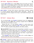
As for the map, of course now that I'm on the spot I have had a hell of a time finding examples online. It also looks like the new stuff may be cleaned up, so maybe other people were having the same problem. Anyway, here is an example; look at the set dressing in room 4 or the pile of treasure in room 9/10 for the sort of stock details that can cause confusion.

One my my pet peeves is the representation of trees in outdoor maps. Cartographers always draw in the canopy. No matter how many times I remind my players, they always seem to forget that the canopy is above their heads, and provides no cover or concealment against enemies on the forest floor. When I draw forest maps, I draw the trunk and the shadow of the canopy. Then I can add undergrowth only if I want it.
 

EOTB

So ... slow work day? Every day?
That CC3 map is overstuffed, and uses their more garish map templates and symbol sets, but I also tend to put descriptive detail in the map. Will that lead to players pixel-bitching? Perhaps for a time, until they readjust their detail sensitivity. Theater of the mind usually focuses on detail that matters; players subconsciously pick up that if detail is presented to them then it deserves their attention.

Once you present a visual environment that's no longer the case. There is no telegraphing what detail is important and what is not - a complete narrative is presented to their eyes in a second that would take some time to verbally round out. But I agree that dropping symbols for every single detail is far too much. I leave out repetitive symbols that would visually clutter the area - debris/decor etc. Show them once, tell them the extent through description.

We then get into how much time they want to exhaust in order to be sure they miss nothing. If they want double-plus confirmation through mundane examination, sans divinations, that the room holds nothing they seek then they'll bring down many meaningless encounters on themselves rooted to one spot. They'll receive this feedback loop until they recalibrate their detail sensitivity.

This isn't for every group of players or DMs. Any who prefer the nod-and-wink of the verbal style where no one has time for a dialogue about stuff that isn't material, so nearly everything discussed is a widget of intended interaction, in some way, won't like this. There's no feeling of surety that a room is empty vs unsuccessfully searched.
 

squeen

8, 8, I forget what is for
I think I am long winded---that's not exactly right (no snarkastic comments please!)...I think I mention (briefly!) a lot of superflilous details for setting and mood, so my players actual miss a lot (i.e. walk past treasure all the time).
 

EOTB

So ... slow work day? Every day?
Mapping, modern or otherwise, can't make something out of nothing. What strikes me about that CC3 map on a second look is that it's just mundane symbol after mundane symbol, stuck on to a mundane map. Less is still more, and the point of visualizing is to present the scene you have in mind.

I'm not saying these are great or anything, but when I make a map - the stuff below is what I'm trying to accomplish. There are rooms that have a lot more going on in them than this, but it's not because I'm trying to think about what a realistic room looks like, and make it so.

Edit - I know some guys who might be playing in my VTT game lurk here, so I'm slapping these in a spoiler tag...if applicable, look at the risk of your own fun ;)


Beoric

8, 8, I forget what is for
See, those maps are nice and spare, with only relevant details and possibly (consciously placed) red herrings. A red herring or two is fine; having several unintentional red herrings is not.

I tend to be light on the red herrings, but I note that at least some of your otherwise empty rooms need red herrings, or players will be able to tell whether actual content is present based on whether a room is empty or not.

Basically, if it is the sort of thing that you would describe to players as soon as they look in the room, it belongs on the map. Otherwise, it doesn't, or it becomes the visual equivalent of wall-of-text.
 

squeen

8, 8, I forget what is for
With digital art like that at your fingertips and a scrolling presentation to the players via a screen (is it a flat panel layed down like a game table? What size.), I can see why there is little buzz about print-map rendering.

Wow. The mind boggles at the possibilities.
 

EOTB

So ... slow work day? Every day?
(is it a flat panel layed down like a game table? What size.)
This is just for VTT. When I'm gaming a face to face group its the more traditional "I describe, you map, we throw down minis/tokens for battles that would be helped by their use"

Edit - but in photoshop I can throw down the entirety of this map and stick a layer on top where the stuff DP talks about is shown - I can put a sound radius transparency in a certain color, or a smell radius, or whatever. For lighting, due to how fantasy grounds is set up, I keep most areas "lit" and just reveal fog of war equal to torch range. But if there's areas where occupants are using torches for ambient lighting I'll drop it into shadow and pop light down where the torches are. In that case I'll put a "torch light" at the entrance of every door on the map (on the other side), so what the players can see from the door is part of the map.
 
Last edited:

Beoric

8, 8, I forget what is for
(is it a flat panel layed down like a game table? What size.)
Several years ago I saw a youtube demo of some people who used a large screen on its back set ups as an actual tabletop. I think it was touch sensitive with the intention that you could place actual figures on it and have the program recognize them. But pretty much everyone just runs them off their laptop, or maybe projects them on their TV. I think this works better anyway, since if you use the screen as a table you have nowhere to put your books and paper without obscuring the view.

It ends up being a different physical space. When I am running games with people at home, especially with players not familiar with the tech, I project a players' map on my TV. That has us playing on the couches instead of at a table. Sometimes I have a desk with two screens, but most times I just sit on the couch with my feet up on an ottoman and a laptop on my lap, with an end table beside me with any paper I think I might need to look at. I toy with the idea of setting it up more like a boardroom, with a large screen on the wall, but I don't think I want the room to feel that businesslike.
 
Top